Data Vizualization
Data Vizualization | Other Projects | Sketch Notes
By: Carlo Liquido
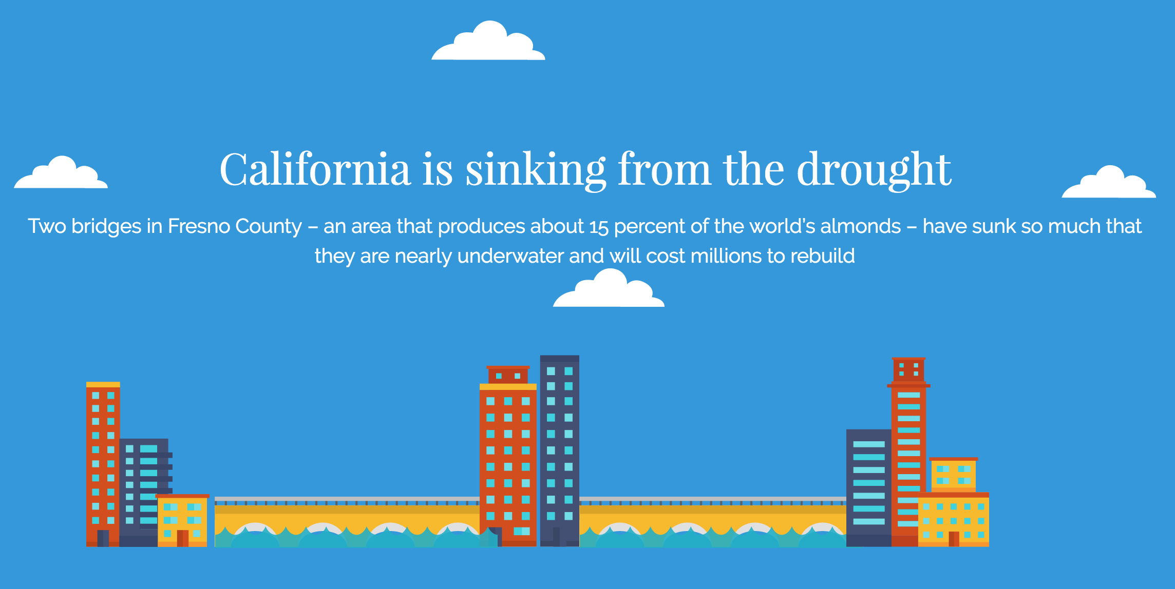
My team won the 'Brave New Hackathon' at UC Berkeely--a hackathon that challenged contestents to create software and visualization projects that tackled the most relevant problems in our society. We decided to create a visualization project to raise awareness around the drought in California. We wanted the public to be fully cognizant of the magnitude of the problem, the source of the problem, and what they can do about it. Our interactive visualization tells a compelling story and links to a Facebook Messenger chatbot named Oasis. Our chatbot, Oasis, chats with users and allows users to take meaningful steps to ameliorate the drought problem. Oasis prompts users to sign a petition, donate to the cause, and connects them with relevant organizations/non-profits. She is the world's first chatbot to allow users to sign petitions.
My team won the 'Brave New Hackathon' at UC Berkeely--a hackathon that challenged contestents to create software and visualization projects that tackled the most relevant problems in our society. We decided to create a visualization project to raise awareness around the drought in California. We wanted the public to be fully cognizant of the magnitude of the problem, the source of the problem, and what they can do about it. Our interactive visualization tells a compelling story and links to a Facebook Messenger chatbot named Oasis. Our chatbot, Oasis, chats with users and allows users to take meaningful steps to ameliorate the drought problem. Oasis prompts users to sign a petition, donate to the cause, and connects them with relevant organizations/non-profits. She is the world's first chatbot to allow users to sign petitions.
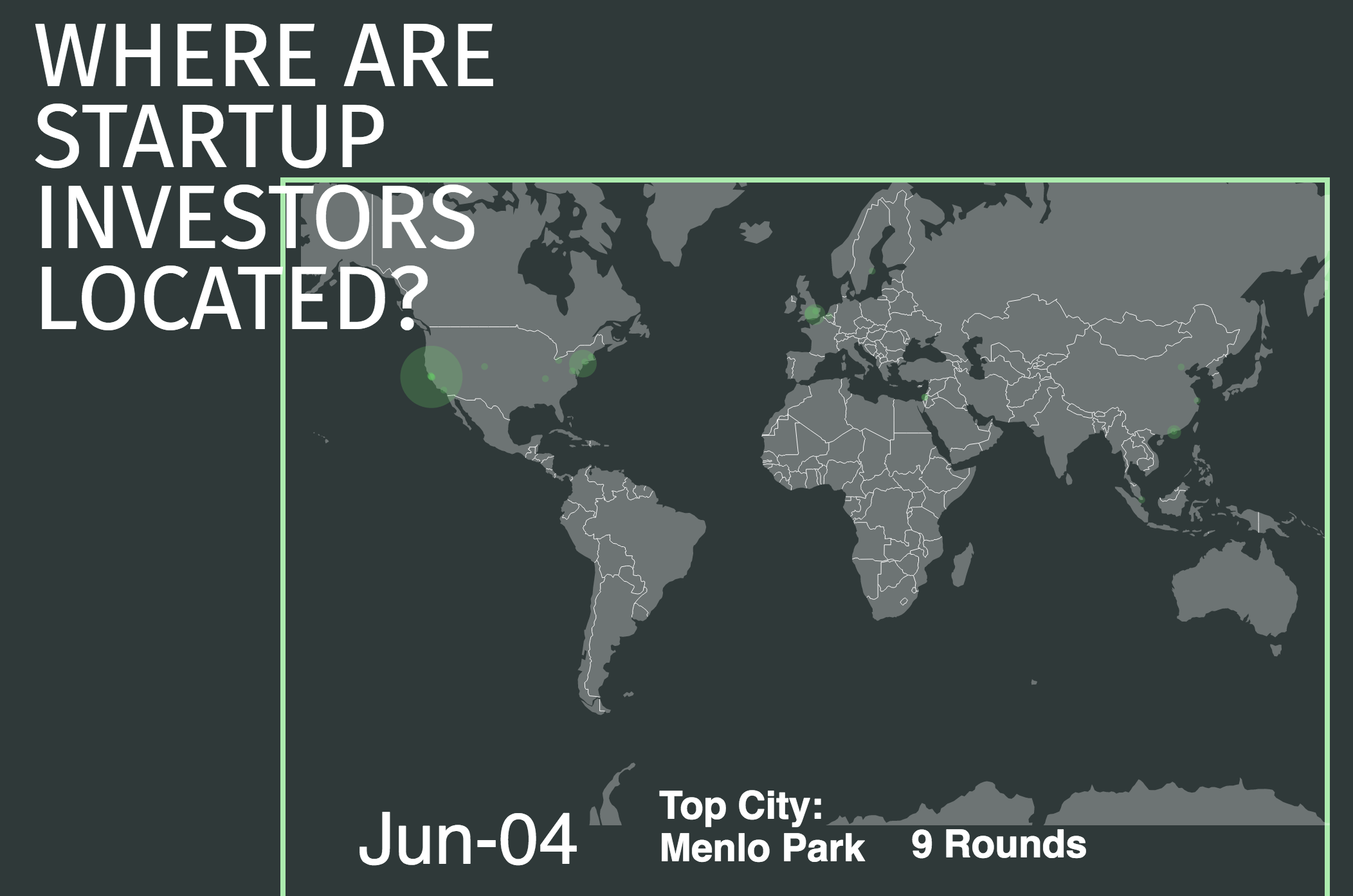
A startup is a new business venture in the form of a company or organization designed to search for a repeatable and scalable business model. These companies are innovative in a process of development, validation and research for target markets. Funds to start these businesses are provided by investors such as venture capitalists through various rounds. TechCrunch has created a platform, called Crunchbase, which is basically a Wikipedia for startups and investors. With the help of this crowd sourced data, our visualization aims to extract information about funding by venture capitalists, and the progress of startups through their stages of funding.
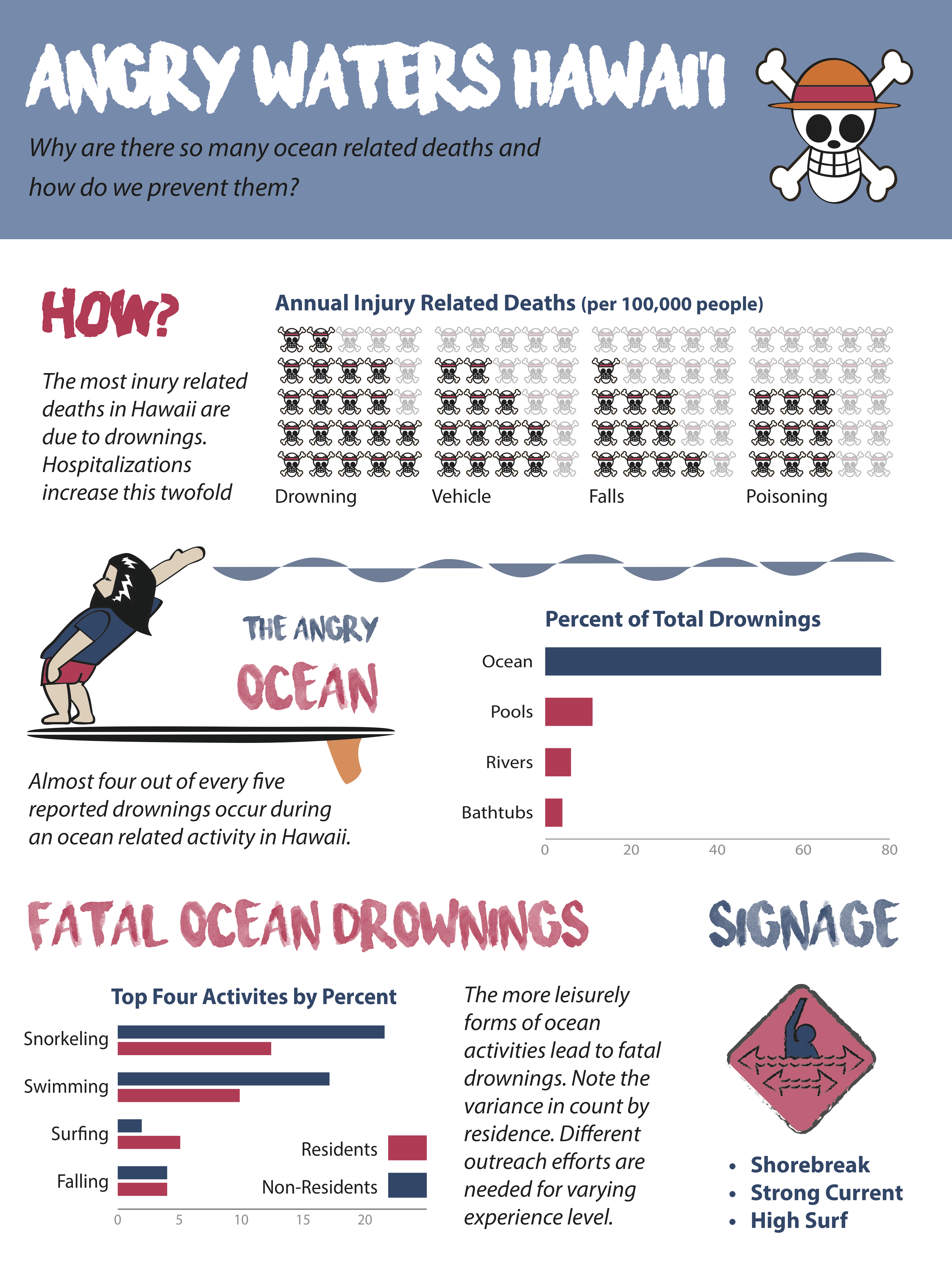
I began this piece under the assumption I would create an infographic that either described surfing or surfboards. My initial idea was to create a guide for beginners learning to surf in Hawaii—when and where to go and what to watch out for. I found a number of newspaper articles on surfing related injuries and deaths, and being a surfer myself realized the inherent dangers. I pivoted my idea to surfing related deaths under the assumption that there would be a plethora of data on this topic and a good story behind it. To my own surprise, what I found was that surfing actually contributed to a small portion of water related deaths. Moving backwards, most injury related deaths occurred in the water. I validated that these water deaths could be attributed (almost 80%) to activities in the ocean. Not only could I demonstrate that snorkeling and swimming were the leading causes (rather than surfing) but I found a marked difference in the types of deaths attributed to residents of Hawaii versus non-residents. Thus, the infographic asks, and seeks to answer, two main questions: why are there so many inury related deaths and how would we even go about preventing them? I gathered my data from two main sources: “Drownings and Near Drownings (Residents and Non-Residents)” and “Visitor Safety: How are we doing?”.
Education Public Report
[R] [RStudio] [ggplot] [grid]
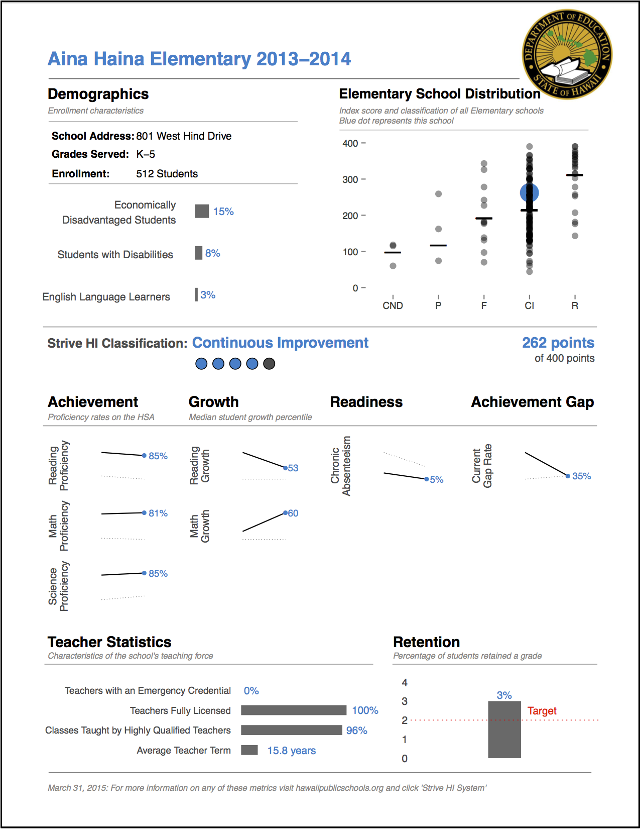
Data visualization has emerged as one of my vocational joys—crafting graphs that help illuminate findings for a broader audience has been galvanizing. In this specific project, our data team at the Hawaii Department of Education (DOE) was tasked to tackle the large-scale project of creating customized reports for each of the 286 schools under the new policy framework, “Strive HI”. In previous years, the DOE had created unintelligible matrices of data. The new framework, however, required unequivocal transparency. I personally lead the development of producing comprehensive yet concise visualizations for each school. The data team challenged me to learn the programming language, R, as no one else had working knowledge of this language. Having to manipulate large-scale assessment data tested my programming abilities. I cleaned, transformed, and merged structured and semi-structured data from various sources. To tackle the problem of suppressing sensitive data and ensuring absolute accuracy, I worked closely with the DOE branch tasked to evaluate our accountability system. The end product is what you see--customized visualizations specific to each of the 286 schools in Hawaii and extensible for each year down the line.
Life Cycle Assessment
[R] [Shiny] [rCharts] [igraph]
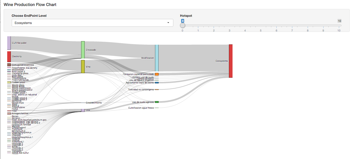
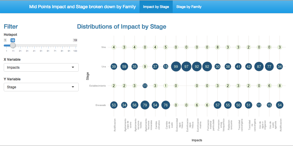
At Fundacion Chile, a sustainability non-profit in Santiago, I was tasked with analyzing and creating interactive visualizations for the Life Cycle Assessment team. The target users: consumers and farmers across all of Chile. The key question to be answered: What are the most crucial hotspots in the production process? The goal of the visualization: to bring transparency and facilitate better decision-making.
The two graphs to the left represent Grape production in Chile. The first of the two graphs is seperated into two tabs. 1) Impact by Stage--simply use the single filter to see which Impact-Stage combinations are greater than the given threshold. 2) Stage by Family--first choose Stage, then use two filters to distinguish hotspots. Contingent Hotspot colors values are orange, while Absolute Hotspot colors values red. Contingnet Hotspots are defaulted to 5% and defines a Family Hotspot as any two Impacts within a Family greater than the (contingent) threshold value. Absolute Hotspots are defaulted to 10% and defines a Family Hotspot as any Impact greater than the (absolute) threshold value. Columns only show hotspots and will subset automatically given the threshold parameters.
The second graph uses a sankey diagram to show the flow of input to ouput. You can subset on EndPoint type and use the hotspot parameter to filter out small values.
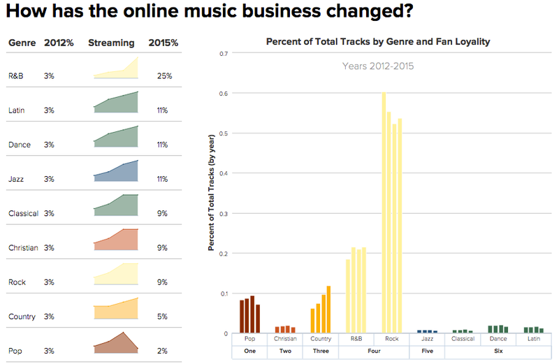
For a class project, we were given a dataset of aggregated music purchases over the course of four years. The tricky part: How to design a visualization within the confined space of a 800 x 600 pixel area. Given that the user is educated and understands the background of the music scence, can the user easily see common trends, make quick comparisons, and distinguish each value? How well does the visualization follow heuristic guidelines? Are you able to answer a wide variety of likely questions about the data? Clearly, no one design will answer all questions, but better designs will answer more.
Strive HI Performance
[d3] [Javascript] [jQuery]
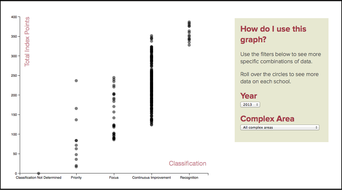
Each year, the Hawaii Department of Education calculates the Strive HI Index Score of each school on a scale of 0 points to 400 points. The Index Score uses multiple measures of achievement, growth, readiness and achievement gaps to understand schools’ performance and progress and differentiate schools based on their individuals needs for reward, support and intervention. Based on these calculations, schools are placed in one of 5 "Classification" Steps — Recognition, Continuous Improvement, Focus, Priority and Superintendent’s Zone — as they strive for continuous improvement. However, the absolute Index Score does not alone constitute which Classification a school belongs to. For instance, a school with an above average Index Score may have extremely poor Chronic Absenteeism. Irrespective of their total Index Score, the school requires immediate intervention and could very well be placed in Focus or Priority. The graph demonstrates the extent of this overlap, something that had never yet been realized. The graph also addresses the distribution of schools across year and Complex Area (i.e., District).

The new Accountability System for the Hawaii Department of Education heavily involves two metrics: student achievement and student growth. Achievement tests have been administered for decades. Growth scores, on the other hand, are new and little understood. They take into account how students perform against similar peers across time. Principals and teachers, however, don't buy into this new analysis. Their theory is--schools with high-performing students will have higher growth while schools with "low-performing" students will have lower growth. My job was to disprove their theory using real objective data.