Immersive Data Viz Wall:
Immersive Data Visualization Display for User Engagement
[Illustrator] [Angular2] [UX Research] [Interaction Design] [Community Engagement]

Lead the effort in re-developing an interactive, internal-only visualization display (nine 60” screens combined) to create a more data-driven environment in the company’s internal community. I conducted extensive user research (quantitative and qualitative), implemented the graphic designs (Illustrator), and developed the application prototype (Angular2).
The Product Analytics team at the company had already created and installed this visualization display—which they called the ‘Data Wall'. The visualization was meant to create a more data-driven environment within the internal global community. However, the display did not incite the action or inspiration it originally had set out to accomplish. In the summer of 2016, I was tasked with researching, re-designing, and re-developing the next iteration of the Data Wall. My main motivation was to find out both why and how I could create this data-driven enviornment through an interactive data visualization installation.
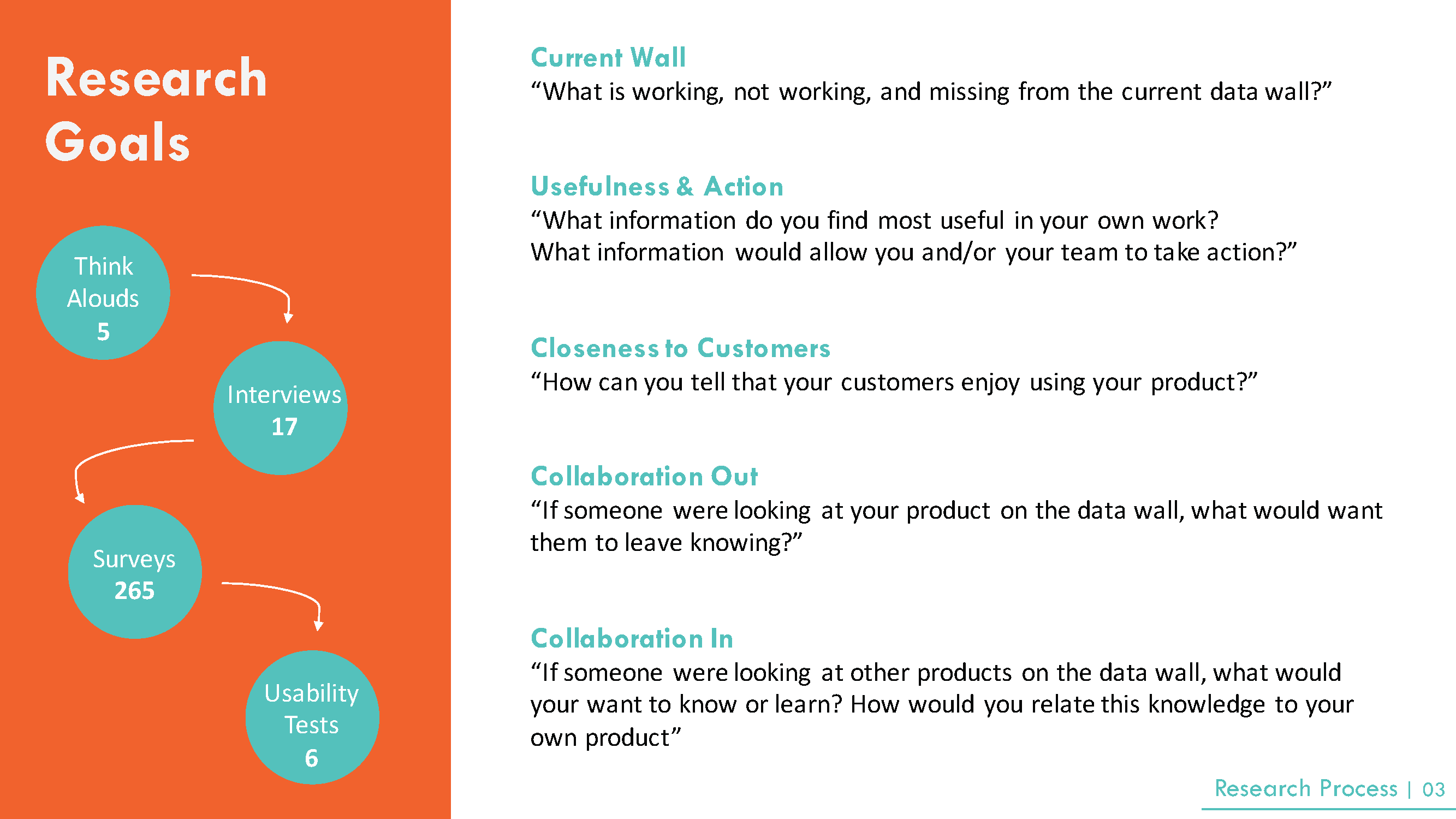
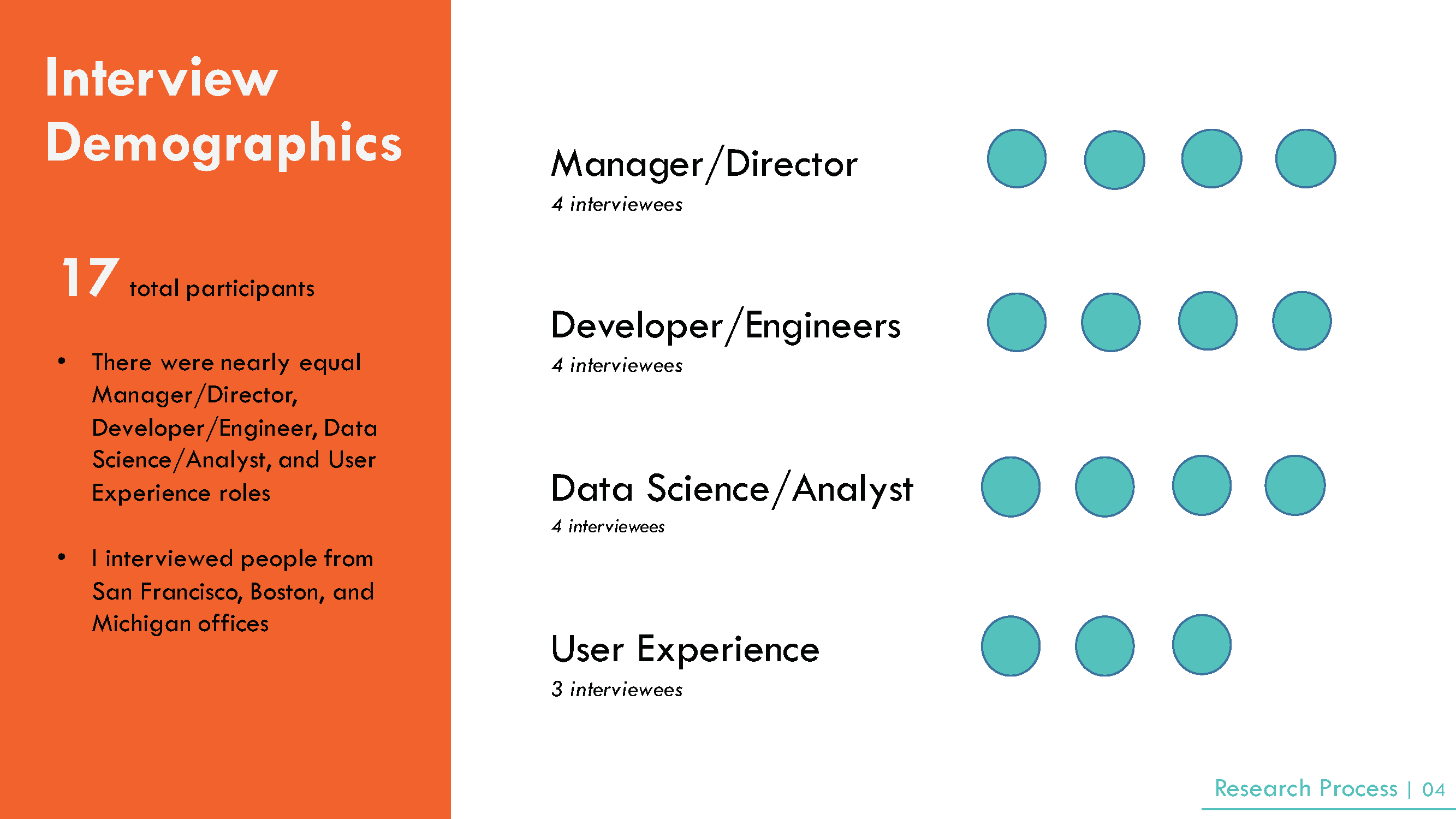
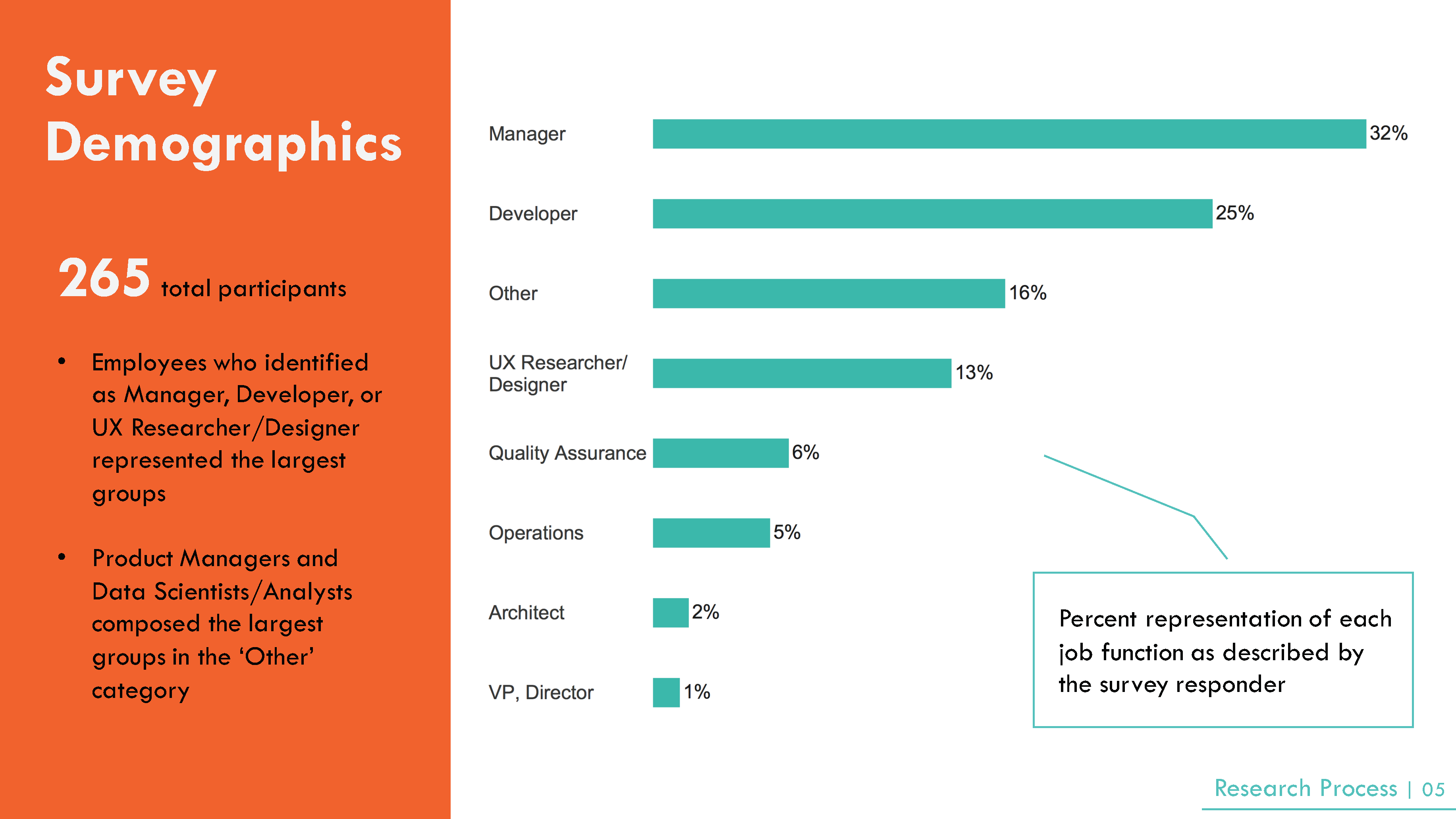
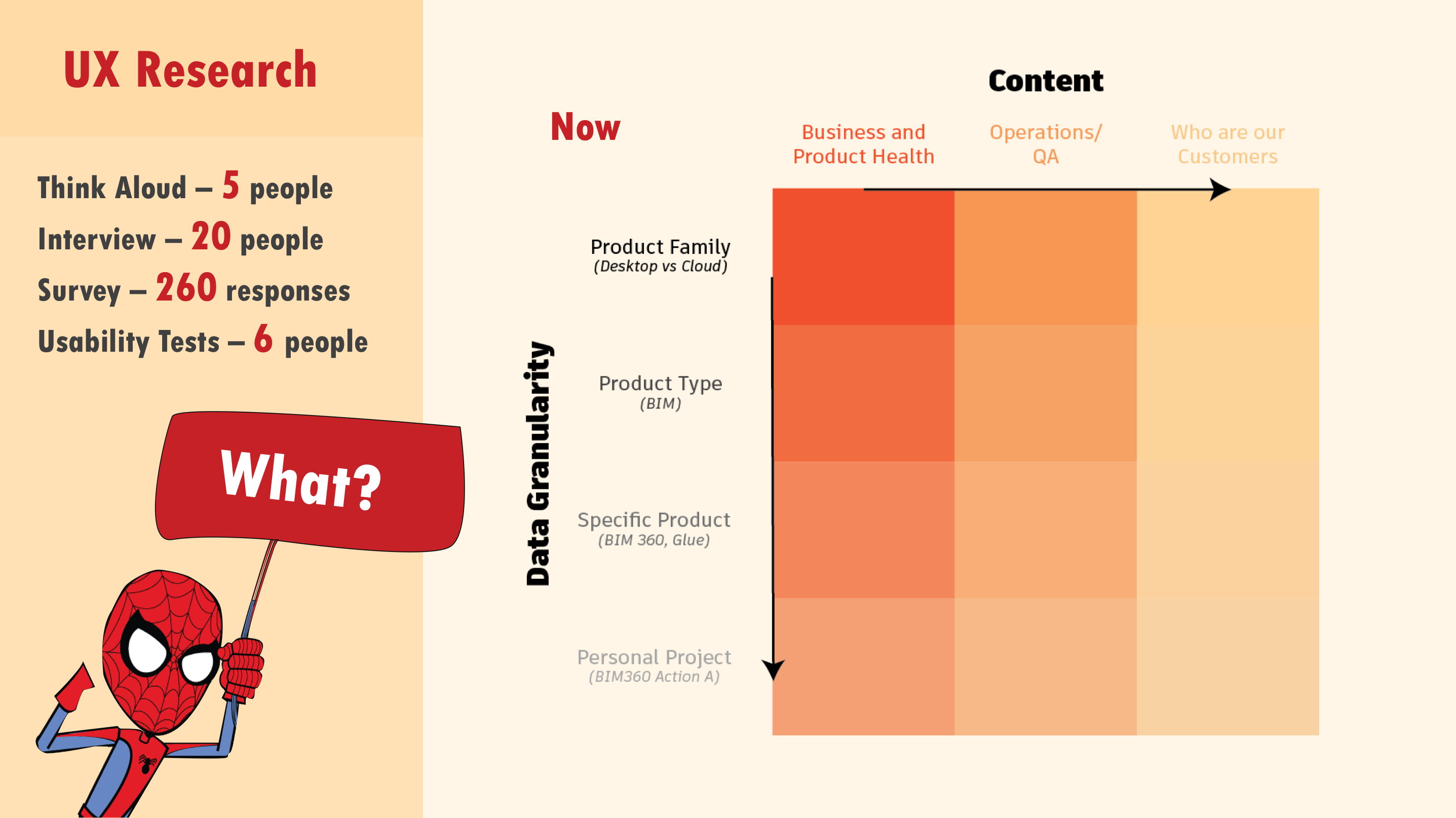
My primary research goals were to find out what was working, not working and missing from the current Data Wall. For the next iteration of the Data Wall, what information would the community find most useful and what would actually lead to action. From a more emotional standpoint, how could workers become more invested and how might they feel closer to the customers they were building this software for. Lastly, how could such an installation lead to higher collaboration. I conducted 5 think-alouds, 17 interviews, and 6 usability tests and analyzed 265 survey responses from the global community. The interviews were composed of a fairly even number of Manager/Director, Developer/Engineer, Data Science/Analyst, and User Experience roles. All interviews were conducted in the United States. I created a survey to dive deeper into certain research questions as well as to reach the broader global community.
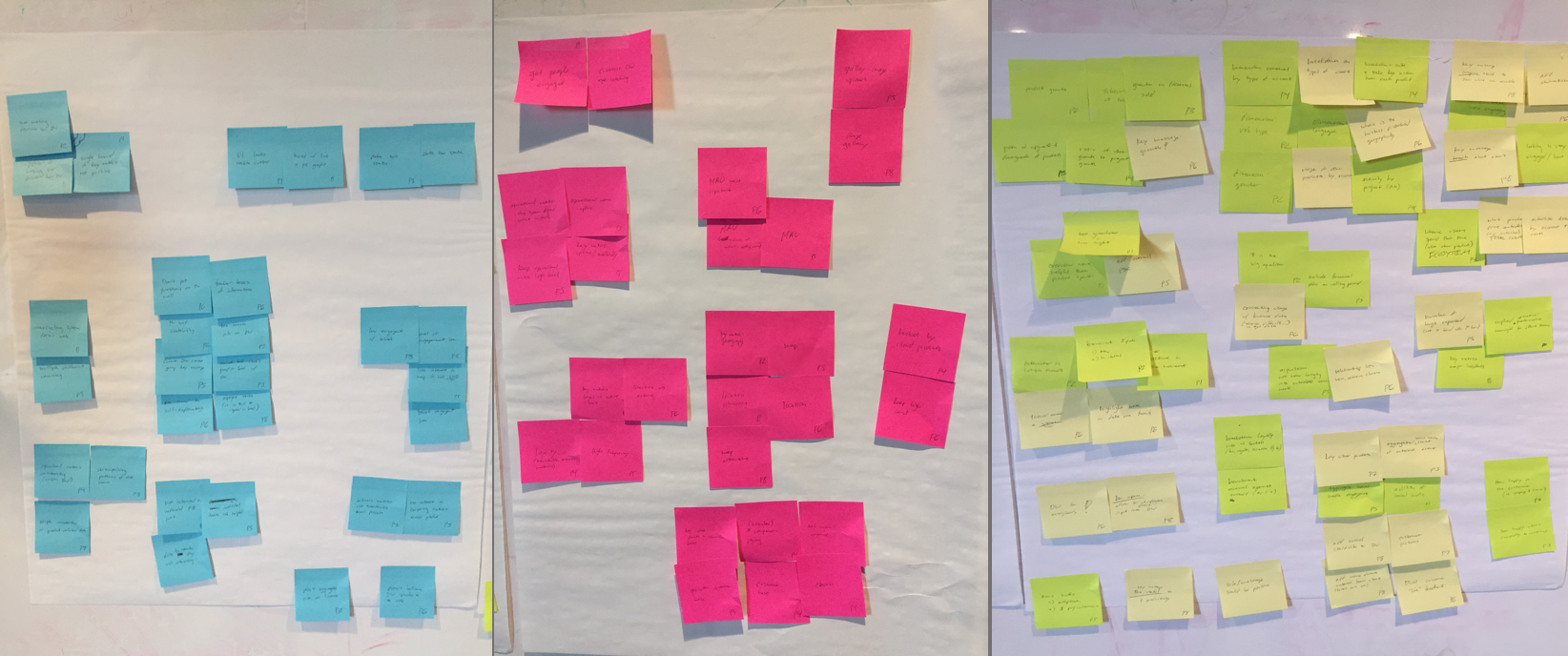
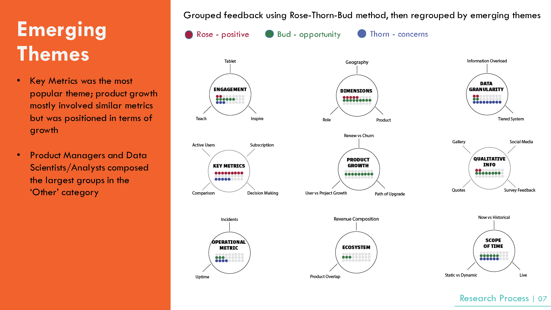
I came away with key takeaways that answered three overarching questions about they ‘Why’, the ‘Who’, and the ‘What’ of the Data Wall. After the think-clouds, interviews, and survey responses I used the Rose-Thorn-Bud method to extract key emerging themes. ‘Why’ - I discovered that many employees wanted to find meaning in the company's customers and wanted a better understanding of key business metrics and product health metrics. I recommended to strive for creativity, to avoid opaque statistic, and focus on growth. ‘Who’ - I noticed that many employees remarked on the gap they felt between themselves and the customers who used their product. I emphasized the fact that the Data Wall should create a more personalized relationship between employee and customer by showing what projects their customers are working on and what expectations they have. Moreover, we should avoid metrics which are abstracted away from employees’ daily work. Rather we should show metrics which can be linked back to an action taken by the user. ‘What’ - I found that there were many conflicting views on what type of content should be displayed on the Data Wall. Many employees also commented on how the display was overwhelming and cluttered. I proposed to create a tiered system that could break down content and data granularity.
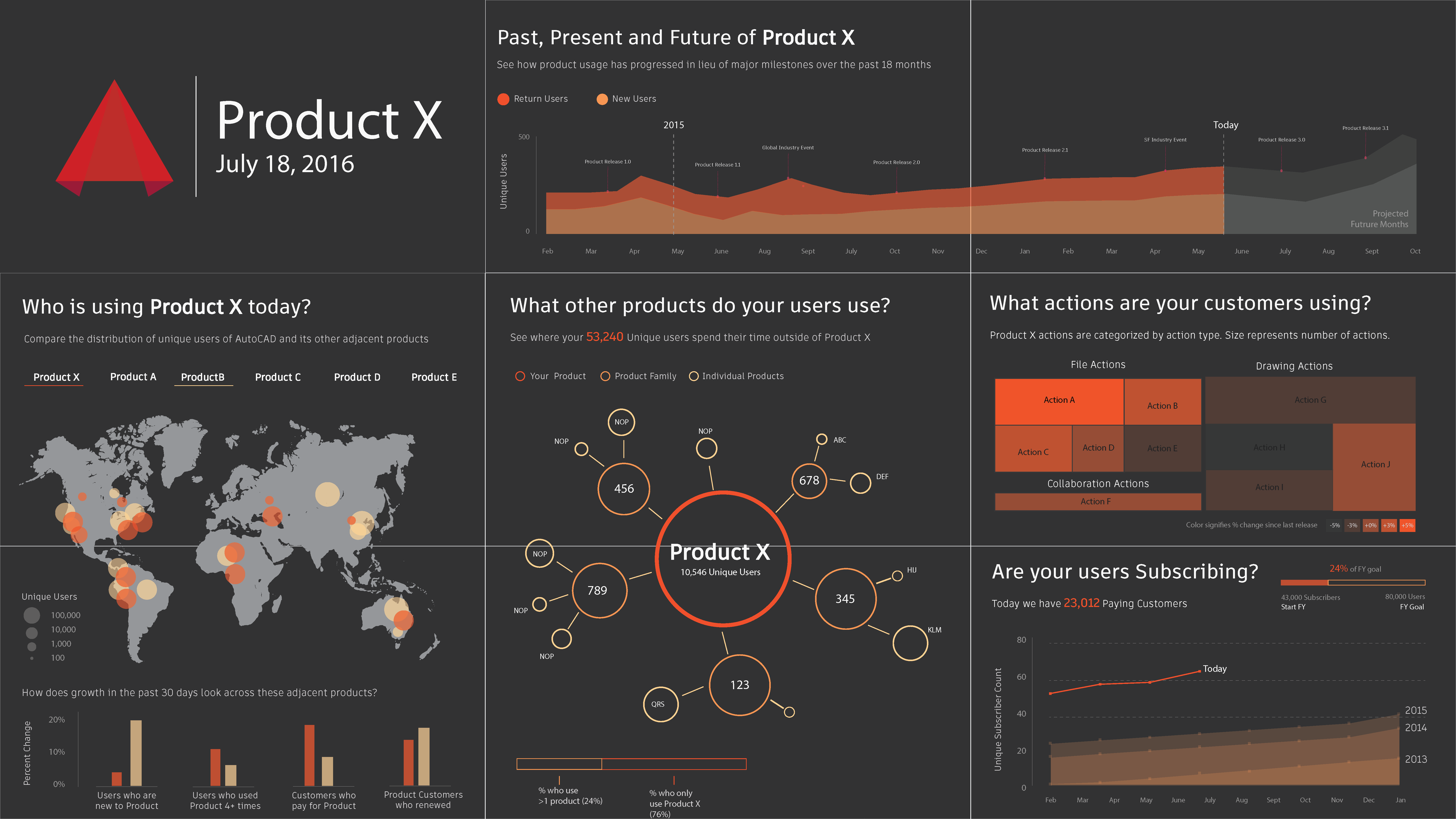
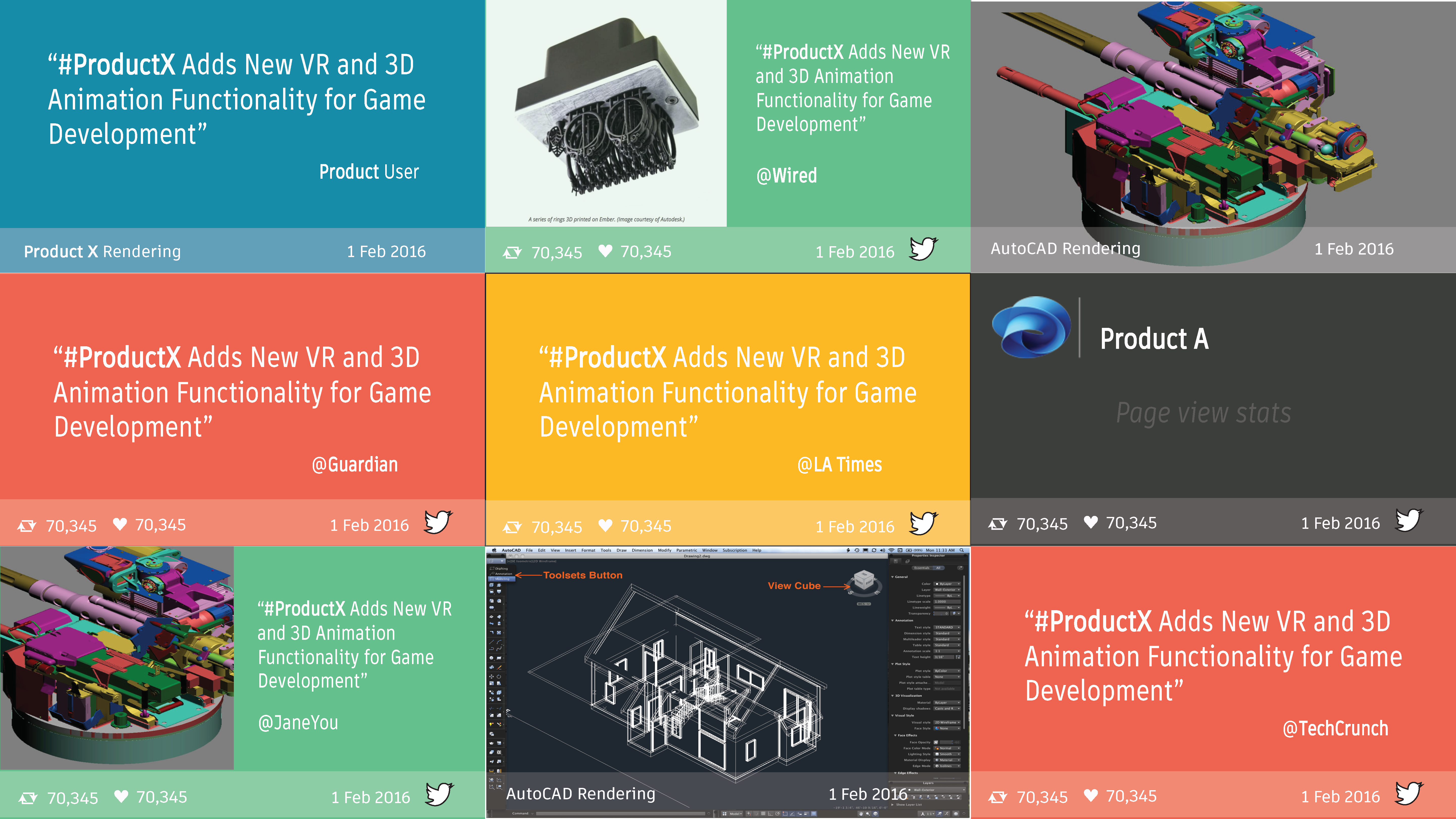
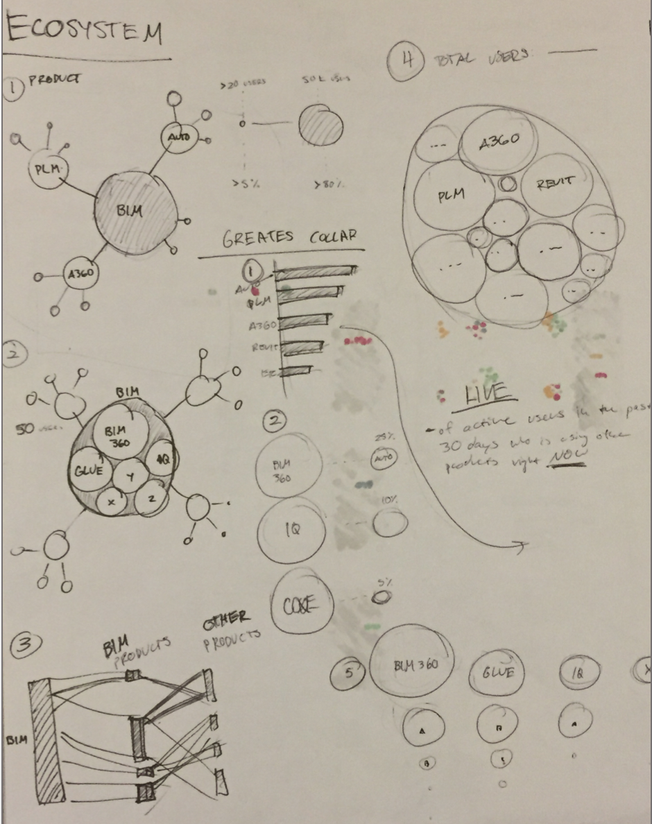
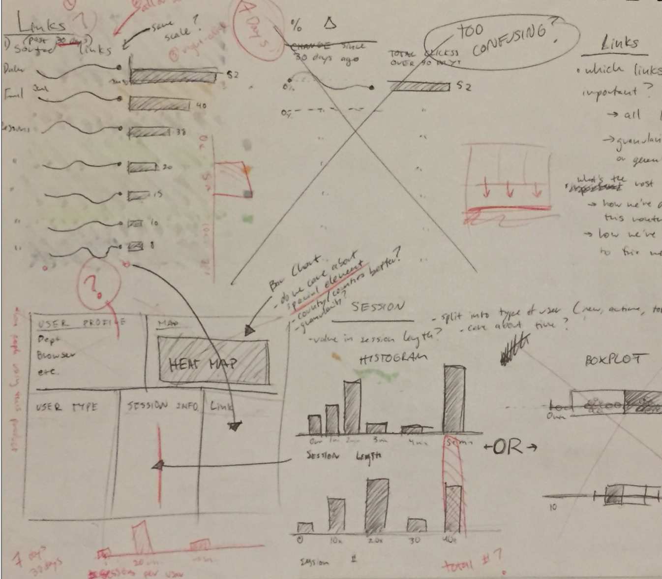
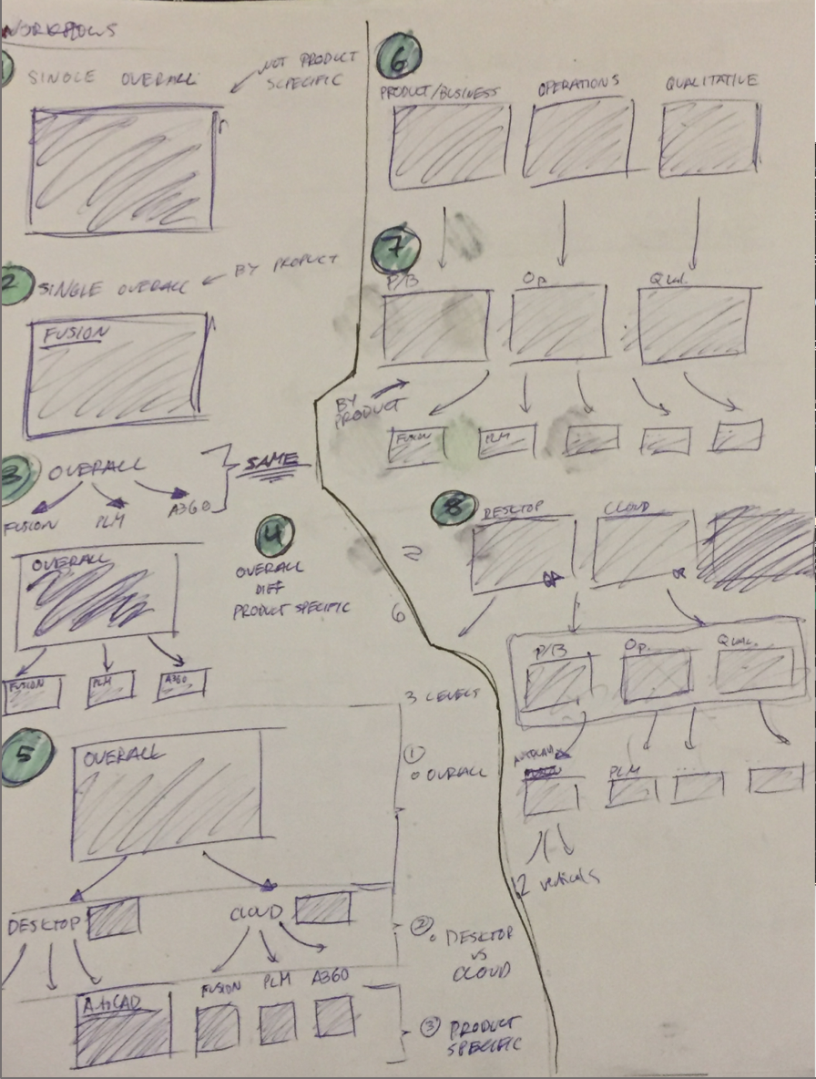
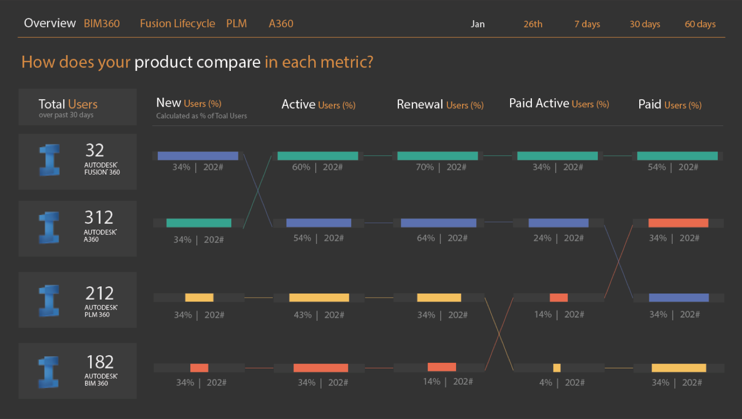
The current Data Wall had attempted to show every type of data to all members of the internal community. It completely failed to address the diversity of the company. From my research, I found that three main stakeholders existed: those who wanted business metrics, those who wanted social impact and feedback information, and those who wanted network and availability updates. I created a tiered system for each product where all three types of information were reflected in three distinct dashboards. I also created varying levels of granularity where products were bucketed into similar verticals. I re-designed the first two dashboards (i.e., business metrics and social impact/feedback) based on my research. As shown above in the images, I went through a number of sketches and iterations. For every idea, I sketched out the visualization in 7 different ways. I received constant feedback from my manager and from the lead UX Developer on the team. I chose warm colors for the business metric dashboard to create a sense of closeness. I tried to address each of the main questions which surfaced from my research without creating clutter. Developing for nine screens inherently made the display look separate and static. I found that nine distinct screens with nine distinct visualizations was overwhelming for the user. I purposefully designed visualizations that overlapped from one screen into the next to break down this barrier. I also chose fairly conventional graph types to have a more formal effect. When developing for the social impact and feedback dashboard, I took a completely different approach. I used shades of different primary colors for a more playful effect. The screens would also alternate randomly to make it seem as if users were tweeting or sending images in the moment. This dashboard attempted to make employees feel closer to their customers.
The visualization display could become even more interactive and engaging. Although users can navigate through the installation with the nearby tablet, many seldom do. An idea would be to create interactivity through cellphones. There is even the idea of gamifying the experience through a 3D immersive experience. Also, the Data Wall should encourage use and awareness of data. Many researchers wanted to know what data sets existed and how they could leverage them.