How has the online music business changed over the past few years?
For a class project, we were given a dataset of aggregated music purchases over the course of four years. The tricky part: How to design a visualization within the confined space of a 800 x 600 pixel area. Given that the user is educated and understands the background of the music scence, can the user easily see common trends, make quick comparisons, and distinguish each value? How well does the visualization follow heuristic guidelines? Are you able to answer a wide variety of likely questions about the data? Clearly, no one design will answer all questions, but better designs will answer more.
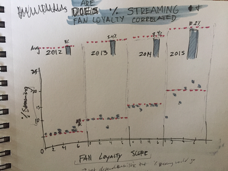
The data consisted of a multitude of types of data: 1) Quantitative Data--total tracks purchased and amount of music streamed; 2) Ordinal Data--fan loyalty scores from 1-6 with lower being better; 3) Categorical Data--genre of music. The data was collected from years 2012-2015.
| Genre | 2012% | Streaming | 2015% |
|---|---|---|---|
| R&B | 3% | 25% | |
| Latin | 3% | 11% | |
| Dance | 3% | 11% | |
| Jazz | 3% | 11% | |
| Classical | 3% | 9% | |
| Christian | 3% | 9% | |
| Rock | 3% | 9% | |
| Country | 3% | 5% | |
| Pop | 3% | 2% |
As a team of two, we went through a number of iterations. The project emphasized peer learning, namely to be open to new suggestions and changes in direction (your first idea is most likely not your best idea!). Seperately, we both created 3 designs and shared all 3 designs with each other for critique and revision. We both quickly realized that visualization real estate was our biggest hurdle--how to convey the most amount of data without losing sight of the basic information.
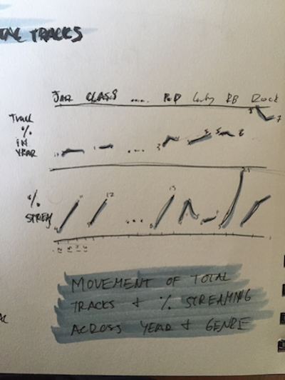
We utilized two main types of charts: line and bar. The line graph was most suited for percent streaming, being for the simple reason that line graphs are accuracte and demonstrate trends in data well. A bar graph was utilized for percent of total tracks so the user could make precise comparisons. We both concluded that using absolute total tracks purchased was misleading (e.g., an absolute increase in purchases of Rock music from 2014 to 2015 may actually be a decrease in relative amount of Rock music purchased). Deriving a percent allocation leads to a more informed comparison.
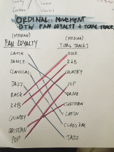
Separately, the two graphs provide substantial information. The user can easily tell that streaming generally increases from 2012 to 2015. Ordering the genre frees the user from mapping out those comparisons and allows him/her to drill down into the data (e.g., R&B has a distinct increase while Pop remains relatively stable). The percent of total tracks purchased also reveals some interesting information on first glance. We were aware that the humans' eye is selective--in creating these charts, we made use of this by grouping elements by fan loyalty. Genres with fan loyalty scores from 1 to 4 generally seem to have higher purcahses while genres with scores greater than 4 have extremely low purchases.
The ability to make comparisons was one of our major goals for the user. Although color is generally not good at inherently encoding data, we utilized color pattern to highlight groupings. Without looking at the actual values, one can deduce that warmer colors group on the lower end of streaming music while cooler colors dominate the upper region. Similarly, warmer colors reside on the left end of the total tracks purchased while cooler colors take on the right region. The user can make further judgements as to why these patterns exist and if they make sense to what one might have expected.