Growth vs Achievement:
How does student growth relate to student achievement?
[Data Visualization] [R] [RStudio]
Project lead in Data Analysis and Visualization
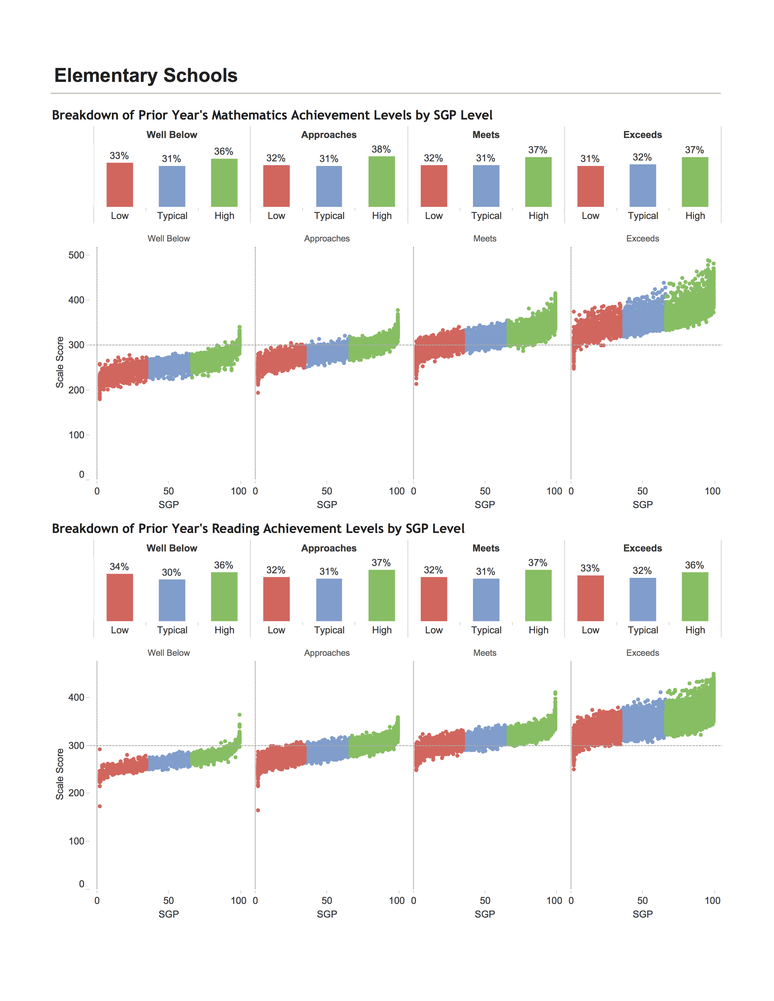
The new Accountability System for the Hawaii Department of Education heavily involves two metrics: student achievement and student growth. Achievement tests have been administered for decades. Growth scores, on the other hand, are new and little understood. They take into account how students perform against similar peers across time. Principals and teachers, however, don't buy into this new analysis. Their theory is--schools with high-performing students will have higher growth while schools with "low-performing" students will have lower growth. My job was to disprove their theory using real objective data.
Although a seemingly easy answer, the data visualization took on a number of iterations. The deeper I went into the problem, the more challenges I faced. How do I balance originality and familiarity? How do I introduce multidimensionality of data without causing unecessary complexity? How do I taylor the graphic so that teachers, principals, and administrative leaders can equally understand the meaning? And how do I execute all this within a single static page?
By breaking down the four Achievement groups (Well Below, Approaches, Meets, Exceeds) by their Student Growth Percentile groups (Low, Typical, High) we see a fairly even distribution (range of 31% to 37%). From a very high level, this two-dimensional graph demonstrates that students who have low Achievement scores (ie, Well Below) and students who have high Achievement scores (ie, Exceeds) share a similar and fairly equal distribution of Low, Typical, and Normal student growth. Drawing a scattor plot of Achievement score by Student Growth Percentile deptics a simlar story at a more granular level. The share of student growth remains equally distributed within each Achievement group. Moreover, within each Achievement group, we notice a slight positive correlation between Achievement score and Student Growth.
There are an inumerable number of ways to represent data. This project made that hardship very clear. I fumbled around with a number of different sketches and threw out most. But in the end, the most important factor to the success of the visualization was to pick a story based on the user's needs. By empathizing with the user and defining a goal, I was better able to ideate and create something impactful.